// 00 — BRAND
The mark is the robot’s face.
A rounded lens with two eyes cut out of it. Not an orb, not a paw, not a silhouette of a robot — the one part of the machine people actually look at. It is a single shape in a single colour, so the same file works as a favicon, a laser etch, an embroidery file and a sticker without a variant. And it can blink, which is worth more to a robot project than it sounds.
// 01 — LOCKUP
Mark left, wordmark right. The wordmark’s cap height is set against the eyes rather than the lens, which is why it looks small next to the mark and correct next to the eyes. Clear space on all sides is the width of one eye.
// 02 — COLOUR
One accent, and it is not a gradient.
Ember does the work of an indicator lamp: it marks the thing that is live, the thing that is measured, and the one action worth taking. If more than a few percent of a screen is ember, it has stopped meaning anything.
It replaced an acid yellow-green, and the reason is the film. The film is graded teal, and orange is teal’s complement — the pairing every colourist reaches for because it works. Yellow-green sits next to teal on the wheel and goes muddy against it. The accent now agrees with the one finished asset the project has instead of fighting it.
It also suits the thing itself. Orbie sits on a desk and keeps a dog company; an acid green reads as an instrument, and this is not an instrument.
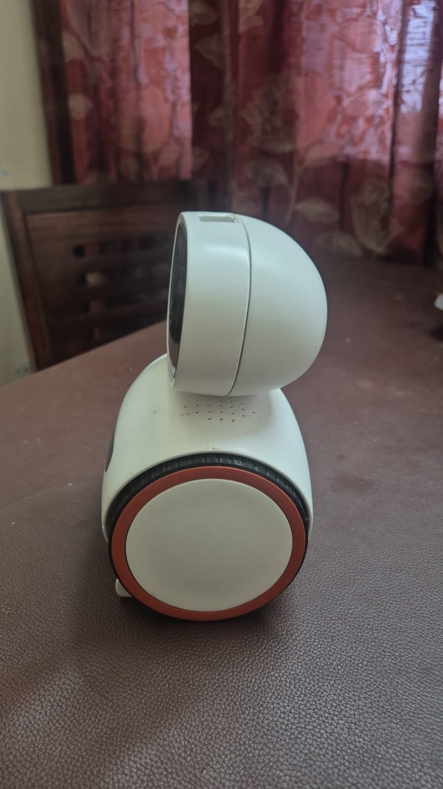
The accent is taken off the machine rather than invented for it, which is the only good reason to pick a brand colour. Ember is a cleaner, brighter reading of that rim than the photograph shows — it was shot under warm indoor light that drags everything toward brown.
- Ground
#0A0D12The background, nearly everywhere. - Panel
#0E1319Raised surfaces, cards, the ticker. - Line
#1E2831Hairlines and grid rules. - Ember
#FF6B2CThe accent. The mark, live values, one action per screen. - Alu
#F2F3F2Primary text. - Alu 2
#98A3ACBody copy. - Alu 3
#5D6870Labels, captions, anything secondary.
// 03 — TYPE
SPACE GROTESK
Aa
Headlines and the wordmark
Weights 500, 600 and 700 only. Headlines set tight — leading around 1.05 — and never in all caps above a few words.
JETBRAINS MONO
Aa
Body, labels, everything else
Monospace for body copy is unusual and it is doing a job: this is an engineering project, and the type should say so before the words do. Labels are uppercase at 10–11px with 0.14–0.2em tracking.
// 04 — FILES
Every file is monochrome and inherits its colour from whatever it sits in (currentColor). There is no dark variant and no light variant, because there does not need to be.
- mark.svgPrimary mark. Use this one unless you have a reason not to.
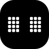
- mark-matrix.svgDot-matrix cut. Above 64px only — the pixels fill in below that.
- face.svgWide lens at the hardware’s own 1.6:1. For product contexts.
- favicon.svgSmall-size cut: tighter radius, fatter eyes. 16–32px.
- wordmark.svgORBIE outlined from Space Grotesk 700. No font needed.




// 05 — PLEASE DO NOT
- Do not add a second colour to the mark. It is one shape in one colour, and that is the whole point.
- Do not put the mark on a busy photograph without a solid holding shape behind it.
- Do not stretch the wordmark, re-space it, or set it in a different face. It is outlined so nobody has to.
- Do not use the dot-matrix cut below 64px. The pixels merge and it turns to mud.
- Do not rotate or tilt the mark. It is a face — a tilted face reads as a mistake.
- Do not use the old gradient "OrbieRobot" wordmark, the terracotta paw, or anything carrying PawMe or OpenPaw.